ClearButtonMode in React Native TextInput
Published On: 2024-03-14
Posted By: Harish
For search inputs, we may see a close button inside the text input to clear the text. And this clearButtonMode prop does the same.
When this prop is used, we can see a default icon which clears the text when pressed. It has four enum values never, while-editing, unless-editing and always. The default value is never. I will tell the difference between these values in the implementation below. Also note that this prop is only available for iOS devices and not for android.
In this post, we will see the working of clearButtonMode prop and also implement the same functionality for android devices.
Lets create a new app.
Create A New Project
Create a new react-native project by using npx. Check documentation for creating a new react native project.
npx react-native@latest init TextInputRN
Example Implementation
We will implement a simple screen with a search text input. When we type text, an icon will appear inside text input and closes when text is cleared. This functionality is implemented with clearButtonMode prop as well as our custom implementation.
I changed the app.tsx file to an arrow function for ease. Import TextInput and add needed props for search.
//app.tsx
...
<TextInput
  style={styles.input}
  keyboardType='default'
  placeholder="Search"
  placeholderTextColor='gray'
  showSoftInputOnFocus={true}
  autoCorrect={false}
  autoFocus={true}
/>
...
I'm using showSoftInputOnFocus, autoCorrect and autoFocus props to the text input.
If we run the app in iOS device or emulator,
#for Android
npx react-native run-android

#for ios
npx react-native run-ios
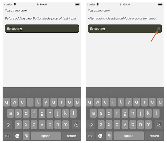
And type into the search field, text will appear and there is no way to clear the text other than a custom implementation.
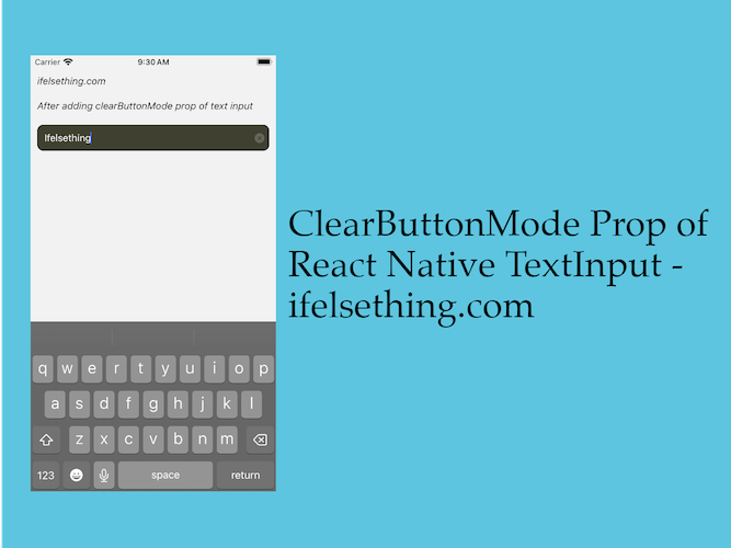
Now add clearButtonMode='always' prop and re-run the metro builder. If you type now, you will see a small and light close icon inside right of the text input.
If we press the close icon, text will be cleared automatically and that's the use of clearButtonMode prop.
This prop's values are linked with editable prop and the default value of the text input when rendered. The never value means never show the close icon, always is to show the icon always irrespective of default value and editable prop value.
Now, while-editing value is to show an icon when editable prop value is true. Icon will be hidden when the value is false. And unless-editing value behavior is opposite of while-editing. Icon will show when the editing prop is false. To get an idea, add a default value to search text input and experiment with the values.
This is one of the best ways to clear text, but it has limitations. As I already mentioned, this prop is not available for android devices and other main concern is the icon's color.
Even for iOS devices, dark themed apps can be benefited from this icon as changing size or color requires code changes in native iOS.
And availability of clearButtonMode for only single line text input is another drawback. If we use multiline prop, we will not see the icon.
So a better way is to implement our own functionality similar to clearButtonMode prop.
Lets implement our custom clearButtonMode for android as well as iOS (as we can completely ignore clearButtonMode prop).
First we will place an icon inside the text input similar to the clearButtonMode icon. We will use react-native-svg library to convert an svg icon into a component.
Install react-native-svg package,
npm install react-native-svg
#or
yarn add react-native-svg
Now, to convert an icon, I'm using a Material close icon which is similar to clearButtonMode icon.
...
import Svg, { Path } from 'react-native-svg';
...
type SvgProps = {
  width?: number,
  height?: number,
  fill?: string
};
...
const ClearIcon = (props: SvgProps) => {
    const {
      width = 16,
      height = 16,
      fill = 'darkorange'
    } = props;
    return (
      <Svg
        height={width}
        viewBox="0 -960 960 960"
        width={height}
        fill={fill}
      >
        <Path
          d="m336-280 144-144 144 144 56-56-144-144 144-144-56-56-144 144-144-144-56 56 144 144-144 144 56 56ZM480-80q-83 0-156-31.5T197-197q-54-54-85.5-127T80-480q0-83 31.5-156T197-763q54-54 127-85.5T480-880q83 0 156 31.5T763-763q54 54 85.5 127T880-480q0 83-31.5 156T763-197q-54 54-127 85.5T480-80Z"
        />
      </Svg>
    );
  };
...
After creating an icon svg component, import useState from react and create a constant, and we will use this state value to set to text input value. Value will update when the onChangeText callback is called.
import { useState } from 'react';
...
const [search, setSearch] = useState<string | undefined>(undefined);
...
<TextInput
  ...
  value={search}
  onChangeText={setSearch}
/>
...
Now position the icon inside text input using style. Clear the state value on icon press and conditionally show the icon when the search value is not empty. See the implementation below.
...
<View style={styles.input_block}>
  <TextInput
    ...
  />
  {
    search
    && (
      <TouchableOpacity
        style={styles.icon_block}
        onPress={() => setSearch(undefined)}
      >
        <ClearIcon />
      </TouchableOpacity>
    )
  }
</View>
...
And that's it. If we re-run the metro builder, we will see the same behavior like clearButtonMode prop but with control over the icon for android and iOS.
Complete code of our example,
//App.tsx
import { useState } from 'react';
import {
  View,
  Text,
  StyleSheet,
  TextInput,
  SafeAreaView,
  StatusBar,
  TouchableOpacity
} from "react-native";
import Svg, { Path } from 'react-native-svg';

type SvgProps = {
  width?: number,
  height?: number,
  fill?: string
};

export const App = () => {
  const [search, setSearch] = useState<string | undefined>(undefined);
  const ClearIcon = (props: SvgProps) => {
    const {
      width = 16,
      height = 16,
      fill = 'darkorange'
    } = props;
    return (
      <Svg
        height={width}
        viewBox="0 -960 960 960"
        width={height}
        fill={fill}
      >
        <Path
          d="m336-280 144-144 144 144 56-56-144-144 144-144-56-56-144 144-144-144-56 56 144 144-144 144 56 56ZM480-80q-83 0-156-31.5T197-197q-54-54-85.5-127T80-480q0-83 31.5-156T197-763q54-54 127-85.5T480-880q83 0 156 31.5T763-763q54 54 85.5 127T880-480q0 83-31.5 156T763-197q-54 54-127 85.5T480-80Z"
        />
      </Svg>
    );
  };
  return (
      <SafeAreaView style={{ flex: 1 }}>
        <StatusBar
          barStyle="dark-content"
        />
        <View style={styles.container} >
          <Text style={styles.text}>
            ifelsething.com
          </Text>
          <Text style={styles.text}>
            After adding clearButtonMode prop of text input
          </Text>
          <View style={styles.input_block}>
            <TextInput
              style={styles.input}
              keyboardType='default'
              placeholder="Search"
              placeholderTextColor='gray'
              showSoftInputOnFocus={true}
              autoCorrect={false}
              autoFocus={true}
              value={search}
              onChangeText={setSearch}
            />
            {
              search
              && (
                <TouchableOpacity
                  style={styles.icon_block}
                  onPress={() => setSearch(undefined)}
                >
                  <ClearIcon />
                </TouchableOpacity>
              )
            }
          </View>
        </View>
      </SafeAreaView>
  );
}

const styles = StyleSheet.create({
  container: {
    flex: 1,
    margin: 10,
    gap: 20,
  },
  input: {
    flexGrow: 1,
    borderWidth: 1,
    borderRadius: 10,
    padding: 10,
    fontSize: 15,
    color: 'white',
    backgroundColor: 'rgba(20, 20, 0, 0.8)'
  },
  text: {
    fontSize: 15,
    color: 'black',
    fontStyle: 'italic'
  },
  input_block: {
    flexDirection: 'row',
    alignItems: 'center',
  },
  icon_block: {
    position: 'absolute',
    right: 7
  }
});
Related Posts
 Keep React Native Keyboard Open Even After Submit
 Hide Cursor of React Native Text Input
- How to Focus Next React Native TextInput on Enter/Next Key Press?
 Enable or Disable React Native TextInput
- Hide React Native Keyboard with Floating Done Button
- How to Disable Auto Correct in React Native TextInput?
 Hide Keyboard on Focus of React Native TextInput
 Keyboard Key Press Events of React Native TextInput
- How to Automatically Focus on Next React Native TextInput?