Get Content Width and Height of React Native TextInput
Published On: 2024-04-10
Posted By: Harish

We know how to get react native text input value and how to convert a text input into textarea. In this post, we will discuss a callback which outputs the text input's content size.
Basically, we can get the width and height of the text input with onLayout callback. But this callback gives the complete text input's size, irrespective of content size.
So, without using onLayout callback, we use onContentSizeChange callback to get content size. With this callback, we will get content’s width and height irrespective of overall text input size. But it is dependable on margin and padding.
Let's see this callback in action.
Create A New Project
Create a new react-native project by using npx. Check documentation for creating a new react native project.
npx react-native@latest init TextInputRN
Example Implementation
We will create a simple text input for the description. This example is taken from react native multiline text input post.
Import the TextInput component in the App.tsx file and add basic required props for description.
Add onContentSizeChange callback function and log the value.
//App.tsx
import { TextInput, TextInputContentSizeChangeEventData } from 'react-native';
...
<TextInput
  style={styles.input}
  keyboardType='default'
  placeholder='Enter Description'
  multiline={true}
  placeholderTextColor='gray'
  onContentSizeChange={e => {
    const size: TextInputContentSizeChangeEventData = e.nativeEvent;
    console.log(size);
  }}
/>
...
Run the app,
#for Android
npx react-native run-android

#for ios
npx react-native run-ios
On render, you can see the log with some values.
 LOG  {"contentSize": {"height": 18, "width": 0}, "target": 375}
 LOG  {"contentSize": {"height": 18, "width": 119}, "target": 375}
Initially, the width is 0 and it again returns another width value. This is the placeholder width.
On typing, the content's size is given priority over placeholder's size in the callback. Height is based on the font size of the text input, so it's constant till increase.
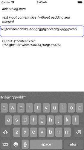
Now, start typing and you will see that the content's width increases till it wraps, and its height increases afterwards.
If text input is not multiline, then only width increases as it becomes single line text input.
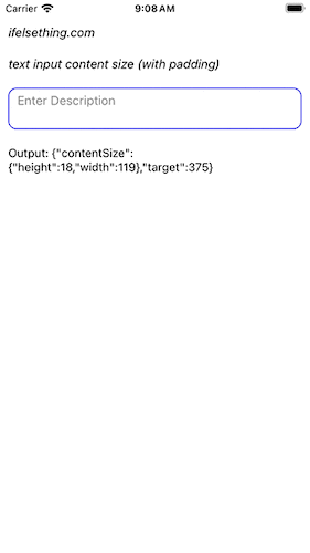
In the above example, you can see that even if text goes to another line, height hasn't increased. This is because of padding.
Even margin or padding inside or outside of text input determines the content size. After removing padding and outer margin of text input, we can see the correct size output but this also depends on letters width too.
Complete code of our example,
//App.tsx
import { useState } from "react";
import {
  Text,
  StyleSheet,
  TextInput,
  SafeAreaView,
  StatusBar,
  View,
  TextInputContentSizeChangeEventData,
} from "react-native";

export default function App() {
  const [event, setEvent] = useState<TextInputContentSizeChangeEventData>();
  return (
    <SafeAreaView style={{ flex: 1, backgroundColor: 'white' }}>
      <StatusBar
        barStyle="dark-content"
      />
      <View style={styles.container} >
        <Text style={styles.text}>
          ifelsething.com
        </Text>
        <Text style={styles.text}>
          text input content size
        </Text>
        <TextInput
          style={styles.input}
          keyboardType='default'
          placeholder='Enter Description'
          multiline={true}
          placeholderTextColor='gray'
          onContentSizeChange={e => {
            const size: TextInputContentSizeChangeEventData = e.nativeEvent;
            setEvent(size);
            console.log(size)
          }}
        />
        <Text>
          Output: {event && JSON.stringify(event)}
        </Text>
      </View>
    </SafeAreaView>
  );
}

const styles = StyleSheet.create({
  container: {
    flex: 1,
    margin: 10,
    gap: 20
  },
  input: {
    borderColor: 'blue',
    borderRadius: 10,
    borderWidth: 1,
    fontSize: 15,
    color: 'black',
    height: 50,
    paddingVertical: 20,
    paddingHorizontal: 10
  },
  text: {
    fontSize: 15,
    color: 'black',
    fontStyle: 'italic'
  },
});
Related Posts
 Hide React Native Keyboard with Floating Done Button
- What is AllowFontScaling Prop in React Native?
 Select All Text of React Native Text Input on Focus
 Disable Copy/Paste in React Native Text Input
- Get Event After Keyboard Opened or Closed in React Native
- Difference Between onEndEditing and onSubmitEditing in React Native
- How to get Keyboard Metrics without Using Events in React Native?
 Icon Inside React Native Text Input
- Get Event Before Keyboard Opening or Closing in React Native