Custom Floating Label Text Input in React Native
Published On: 2024-04-04
Posted By: Harish
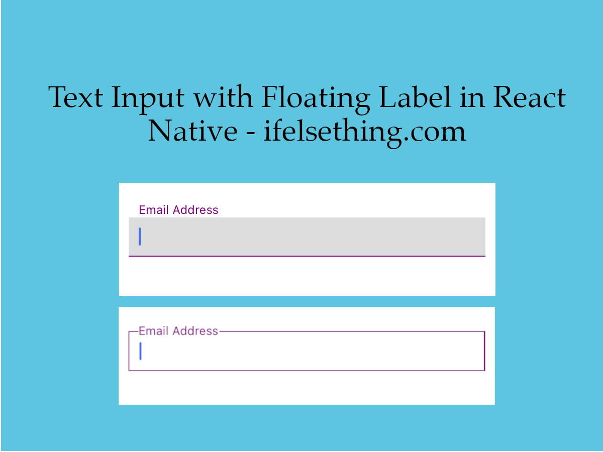
One of the most common text input variants we can see is a floating label input where the label will float to top when input is focused. This can be implemented using third party libraries like react-native-floating-label-input or creating our own custom floating label text input.
In this post, we will create a text input with a floating label when focused. Let's start.
Create A New Project
Create a new react-native project by using npx. Check documentation for creating a new react native project.
npx react-native@latest init FloatingLabelRN
Implementation
Here the idea is to take a text view below text input, make its position absolute and change the text view's style to stick to top or to behave as a placeholder when text input is focused or unfocused.
First part is to take the text input label that behaves as a placeholder when not focused and behaves as a title when input is focused.
As the label is absolutely positioned, tapping on text input where the label is present, will not trigger input press events. To overcome that, we will use the Pressable component to get press events of the input container.
We will be animating the label, so we will use the Animated library's Animated.Text component instead of the Text component.
//App.tsx
...
import { TextInput, Pressable, Animated } from 'react-native';
...
<Pressable
  style={styles.input_block}
>
  <TextInput
    style={styles.input}
    keyboardType='email-address'
    autoCorrect={false}
    autoCapitalize='none'
  />
  <Animated.Text
    style={styles.label}
  >
    Email Address
  </Animated.Text>
</Pressable>
...
If we run the app,
#for Android
npx react-native run-android

#for ios
npx react-native run-ios
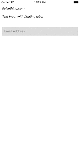
We will see a simple text input and a text view below it. Now we have to make this text view as a label placeholder. For that, we can use the absolute position.
Make the text view absolute with top value to 0 and left to 10. To make it stay on top of text input, we are using zIndex and elevation style properties.
...
input_block: {
  position: 'relative',
  marginTop: 20
},
input: {
  borderColor: 'gray',
  borderBottomWidth: 1,
  padding: 10,
  fontSize: 15,
  color: 'black',
  backgroundColor: 'gainsboro'
},
label: {
  zIndex: 9,
  elevation: 4,
  top: 0,
  left: 10,
  position: 'absolute',
  textAlign: 'left',
},
...
At this point, we will have a label text over text input. But it does not have a proper placement.
To get proper middle placement, we have to know the height of the text input. To get the dynamic height of the text input on render, we can use onLayout callback which returns the rendered metrics of the field.
So, get the metrics of the text input, store them in a state variable using useState hook and use these stored values to properly animate the label.
And we need to know when text input is focused or blurred. For that we will use onFocus and onBlur callbacks to animate the label. We will also use Pressable to programmatically focus on text input using useRef hook.
...
<Pressable
  ...
  onPress={onTextInputWrapperPress}
>
  <TextInput
    ...
    ref={inputRef}
    onLayout={onTextInputLayoutChange}
    value={textInputValue}
    onChangeText={setTextInputValue}
    onFocus={onTextInputFocus}
    onBlur={onTextInputBlur}
  />
  <Animated.Text
    ...
    onLayout={onLableLayoutChange}
  >
    Email Address
  </Animated.Text>
</Pressable>
...
You can find complete callback functions used above in the complete code block.
Now we will animate the label from its center position to top and vice versa. For that we will use the translateY property to push text upwards and downwards.
So, here we need two positions. One, the text input's y-axis center position coincides with the label's y-axis center and another one is above the text input.
We can get first position by subtracting half of the label's height from half of the text input's height. And the second position is pushing the label till the text input’s height. This is because the label text view is below text input.
And we need to animate between these two positions when focused or blurred.
...
const animationValue = useRef(new Animated.Value(0)).current;

const animation = (value: number) => {
  Animated.timing(animationValue, {
    toValue: value,
    duration: 250,
    useNativeDriver: false, // false value is important
  }).start();
};
...
const onTextInputFocus = () => {
  ...
  animation(1);
};
const onTextInputBlur = () => {
  ...
  animation(0);
};
...
const labelDynamicStyles = {
  fontSize: fontSizeAnimation,
  color: fontColorAnimation,
  transform: [
    {
      translateY: translateY
    }
  ]
};
...
<Animated.Text
  ...
  style={[
    styles.label,
    labelDynamicStyles
  ]}
>
  Email Address
</Animated.Text>
...
One important thing to keep in mind is to pass false value to useNativeDriver property to enable font size animation.
We have to animate between values 0 to 1 when focused and from 1 to 0 when blurred. So, we created animations for font size, font color and lable's position.
With this, if you run the app, output will be like below gif.
We can also implement other variations of floating label text input in react native with slight changes in styles and translateY values.
Extract this code into a component with dynamic label names, keyboard type and return value callback to use for different fields.
Complete code of our implementation,
//App.tsx
import { useCallback, useRef, useState } from 'react';
import {
  Text,
  StyleSheet,
  TextInput,
  SafeAreaView,
  StatusBar,
  Pressable,
  Keyboard,
  Animated,
  LayoutChangeEvent
} from "react-native";

type Layout = {
  width: number,
  height: number,
  x: number,
  y: number
};

const initialLayout = {
  width: 0,
  height: 0,
  x: 0,
  y: 0
};

export default const App() {
  const [isFocused, setIsFocused] = useState(false);
  const [inputLayout, setInputLayout] = useState<Layout>(initialLayout);
  const [labelLayout, setLabelLayout] = useState<Layout>(initialLayout);
  const [textInputValue, setTextInputValue] = useState<string>();
  const inputRef = useRef<any>(null);
  const animationValue = useRef(new Animated.Value(0)).current;

  const animation = (value: number) => {
    Animated.timing(animationValue, {
      toValue: value,
      duration: 250,
      useNativeDriver: false, // false value is important
    }).start();
  };

  const fontSizeAnimation = animationValue.interpolate({
    inputRange: [0, 1],
    outputRange: [15, 12]
  });

  const fontColorAnimation = animationValue.interpolate({
    inputRange: [0, 1],
    outputRange: ['gray', 'purple']
  });

  const translateY = animationValue.interpolate({
    inputRange: [0, 1],
    outputRange: [inputLayout.height / 2 - labelLayout.height / 2, -labelLayout.height], // `-labelLayout.height / 2` for second floating label version
  });

  const onTextInputWrapperPress = useCallback(() => {
    setIsFocused(previous => {
      if (previous && !textInputValue) {
        inputRef.current.blur();
      } else {
        inputRef.current.focus();
      }
      return !previous
    });
  }, []);

  const onTextInputFocus = () => {
    setIsFocused(true)
    animation(1);
  };

  const onTextInputBlur = () => {
    if (textInputValue) return;
    setIsFocused(false)
    animation(0);
  };

  const onTextInputLayoutChange = useCallback((e: LayoutChangeEvent) => {
    const layout = e.nativeEvent.layout;
    setInputLayout(layout);
  }, []);

  const onLableLayoutChange = useCallback((e: LayoutChangeEvent) => {
    const layout = e.nativeEvent.layout;
    setLabelLayout(layout);
  }, []);

  const labelDynamicStyles = {
    fontSize: fontSizeAnimation,
    color: fontColorAnimation,
    //backgroundColor: isFocused ? 'white' : 'transparent',  // input style for second floating label version
    transform: [
      {
        translateY: translateY
      }
    ]
  };

  return (
    <SafeAreaView style={{ flex: 1, backgroundColor: 'white' }}>
      <StatusBar
        barStyle="dark-content"
      />
      <Pressable onPress={Keyboard.dismiss} style={styles.container} >
        <Text style={styles.text}>
          ifelsething.com
        </Text>
        <Text style={styles.text}>
          Text input with floating label
        </Text>
        <Pressable
          style={styles.input_block}
          onPress={onTextInputWrapperPress}
        >
          <TextInput
            ref={inputRef}
            onLayout={onTextInputLayoutChange}
            style={[
              styles.input,
              { borderColor: isFocused ? "purple" : "gray" }
            ]}
            keyboardType='email-address'
            value={textInputValue}
            onChangeText={setTextInputValue}
            autoCorrect={false}
            autoCapitalize='none'
            onFocus={onTextInputFocus}
            onBlur={onTextInputBlur}
          />
          <Animated.Text
            onLayout={onLableLayoutChange}
            style={[
              styles.label,
              labelDynamicStyles
            ]}
          >
            Email Address
          </Animated.Text>
        </Pressable>
      </Pressable>
    </SafeAreaView>
  );
}

const styles = StyleSheet.create({
  container: {
    flex: 1,
    margin: 10,
    gap: 20
  },
  input_block: {
    position: 'relative',
    marginTop: 20
  },
  input: {
    borderColor: 'gray',
    borderBottomWidth: 1,
    padding: 10,
    fontSize: 15,
    color: 'black',
    backgroundColor: 'gainsboro'
  },
  // input style for second floating label version. Comment above one and uncomment this one.
  // input: {
  //   borderColor: 'gray',
  //   borderWidth: 1,
  //   padding: 10,
  //   fontSize: 15,
  //   color: 'black',
  //   backgroundColor: 'white'
  // },
  text: {
    fontSize: 15,
    color: 'black',
    fontStyle: 'italic'
  },
  label: {
    zIndex: 9,
    elevation: 4,
    top: 0,
    left: 10,
    position: 'absolute',
    textAlign: 'left',
  }
});
Related Posts
 Press Events of React Native TextInput
 Hide Keyboard on Scroll in React Native
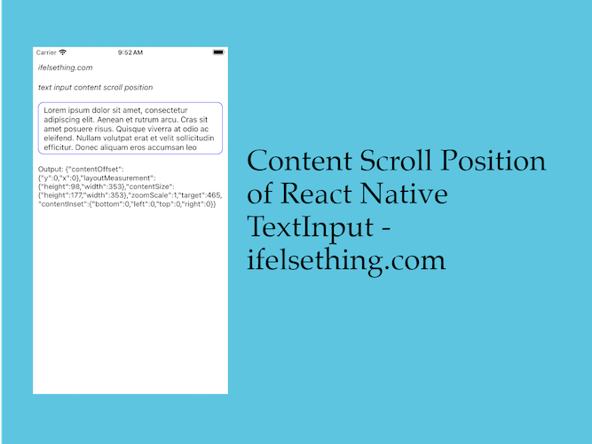 Get Content Scroll Position Inside React Native TextInput
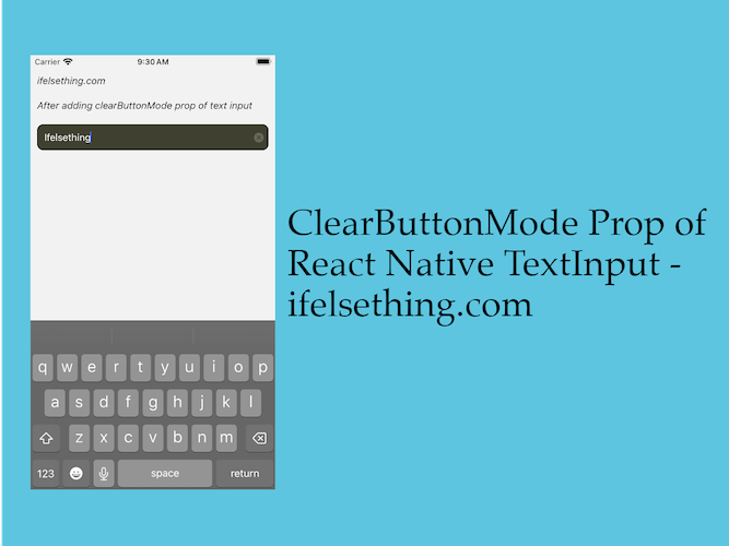 ClearButtonMode in React Native TextInput
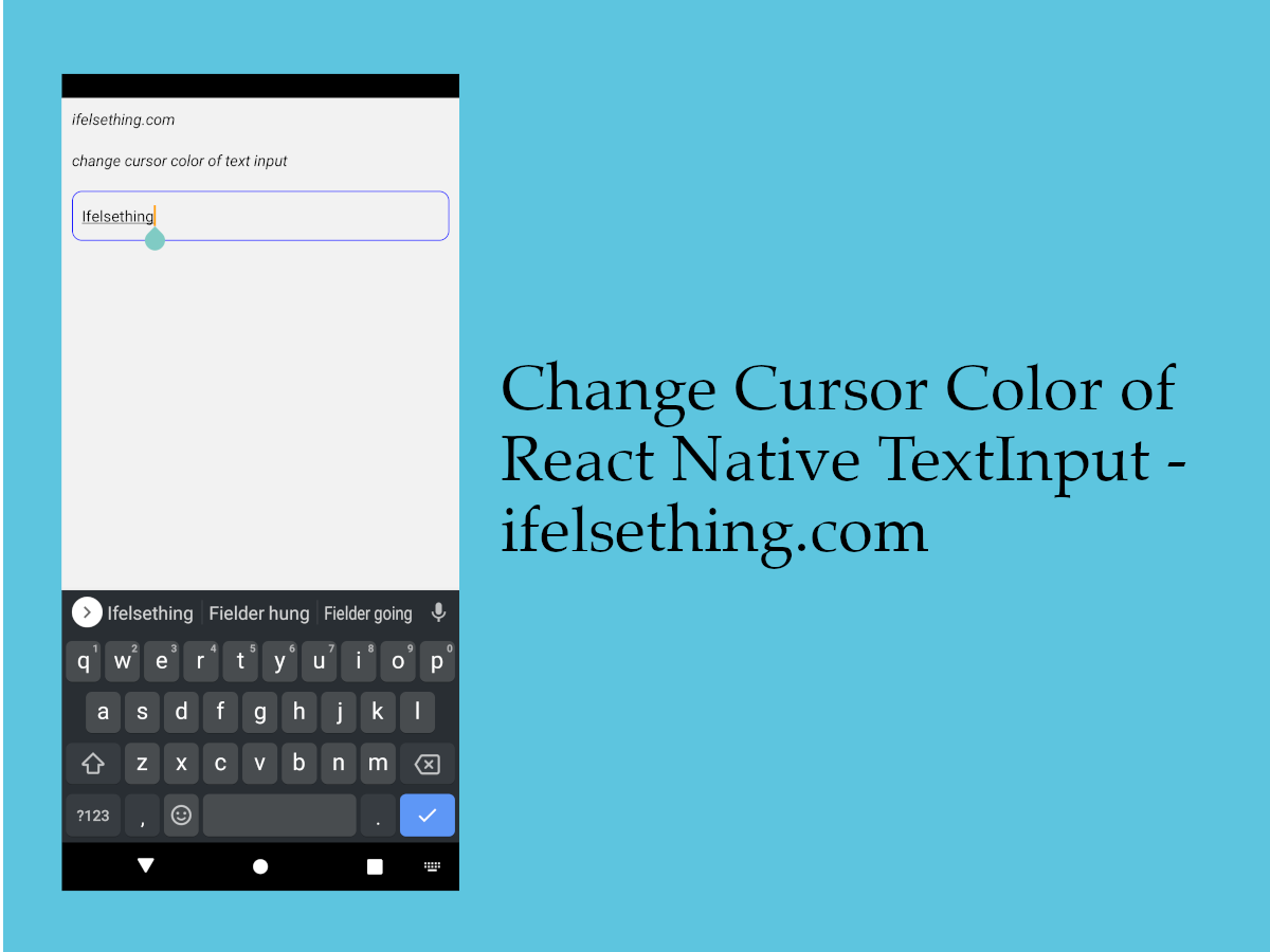 Change Cursor Color in React Native TextInput
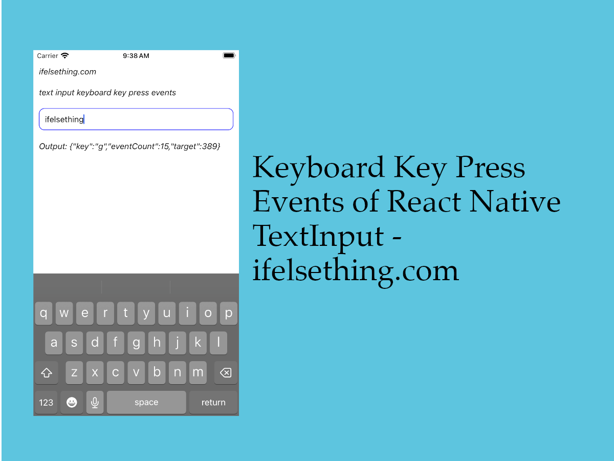 Keyboard Key Press Events of React Native TextInput
 Get Content Width and Height of React Native TextInput
- How to Disable Auto Correct in React Native TextInput?
- How to Focus on React Native TextInput using useRef Hook?