Header and Footer for VirtualizedList
Published On: 2024-07-17
Posted By: Harish

We have seen a way to get individual row events of VirtualizedList and to show an empty data message to VirtualizedList using an individual component when data is empty.
We also saw a way to add a header and make it stick to the top of the view or to add multiple sticky headers in a ScrollView component.
Similarly, we can add a header and a footer to the VirtualizedList.
In ScrollView, we placed a view as a header but in VirtualizedList we have to use ListHeaderComponent callback to add a header component and ListFooterComponent callback to add a footer component to the list.
These components will be placed at the starting and ending of the list.
Let's add them to an example list.
Create A New Project
Create a new react-native project by using npx. Check documentation for creating a new react native project.
npx react-native@latest init VListRN
Example Implementation
We will create a simple colorful vertical VirtualizedList and add a header, footer views to the list.
Import and add VirtualizedList. Add basic VirtualizedList with color blocks. Check basic VirtualizedList implementation for more info.
//App.tsx
...
import { VirtualizedList } from 'react-native';
...
<VirtualizedList
  contentContainerStyle={styles.content_container}
  data={colors}
  getItemCount={getItemCount}
  getItem={getItem}
  keyExtractor={item => item.id}
  renderItem={({ item }) => {
    return (
      <Item color={item.color} />
    )
  }}
/>
...
Run the app,
#for Android
npx react-native run-android

#for ios
npx react-native run-ios
You will see a few colored blocks in the list.
Now, we will add a simple header and footer to the list.
So, create Header and Footer components with basic views.
...
const Header = () => {
  return (
    <View style={styles.component_view}>
      <Text style={styles.component_text}>Header</Text>
    </View>
  )
};
const Footer = () => {
  return (
    <View style={styles.component_view}>
      <Text style={styles.component_text}>Footer</Text>
    </View>
  )
};
...
Add ListHeaderComponent and ListFooterComponent callbacks to VirtualizedList with their respective component views.
...
<VirtualizedList
  ...
  ListHeaderComponent={() => <Header />}
  ListFooterComponent={() => <Footer />}
/>
...
Now re-run the metro builder to see a header and footer to the list.
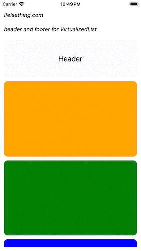
If you observe, for our header and footer components, we wrapped the Text component in a View component with a style to it.
We can remove this extra View component by using ListHeaderComponentStyle and ListFooterComponentStyle style props.
So, let's remove the view component in header and footer components, add ListHeaderComponentStyle and ListFooterComponentStyle props to VirtualizedList and apply styles to them.
...
const Header = () => <Text style={styles.component_text}>Header</Text>;
const Footer = () => <Text style={styles.component_text}>Footer</Text>;
...
<VirtualizedList
  ...
  ListHeaderComponent={() => <Header />}
  ListHeaderComponentStyle={styles.component_view}
  ListFooterComponent={() => <Footer />}
  ListFooterComponentStyle={styles.component_view}
/>
...
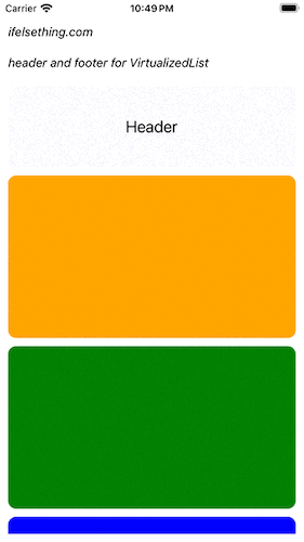
If you re-run the metro builder, you will see that the header and footer views are the same as before..
If we use these style props, a view with style will be wrapped around for header and for footer components individually.
These props only accept View style props because they are applied to a View component.
We can use ScrollView's, stickyHeaderIndices and stickyHeaderHiddenOnScroll props to fix the header to top even while scrolling or hide it while scrolling.
...
<VirtualizedList
  ...
  stickyHeaderIndices={[0]}
  stickyHeaderHiddenOnScroll
/>
...
Visit how to add a sticky header in a scrollview post for better understanding.
Complete code of our example,
//App.tsx
import React from "react";
import {
  Text,
  StyleSheet,
  SafeAreaView,
  StatusBar,
  View,
  VirtualizedList,
} from "react-native";

const colors = [
  'orange',
  'green',
  'blue',
  'maroon',
  'violet',
  'darkorange',
  'gold',
  'darkgreen',
  'aquamarine',
  'cadetblue'
];

type ItemProp = {
  color: string;
};

type ItemDataProp = {
  id: string;
  color: string;
};

export default function App() {
  const Item = (props: ItemProp) => {
    const { color } = props;
    return (
      <View
        key={color}
        style={[
          styles.view,
          {
            backgroundColor: color
          }
        ]}
      />
    )
  };
  const getItem = (data: string[], index: number) => ({
    id: Math.random().toString(12).substring(0),
    color: data[index],
  } as ItemDataProp);
  const getItemCount = (data: any) => data.length;
  const Header = () => <Text style={styles.component_text}>Header</Text>;
  const Footer = () => <Text style={styles.component_text}>Footer</Text>;
  return (
    <SafeAreaView style={{ flex: 1, backgroundColor: 'white' }}>
      <StatusBar
        barStyle="dark-content"
      />
      <View style={styles.container}>
        <Text style={styles.text}>
          ifelsething.com
        </Text>
        <Text style={styles.text}>
          header and footer for VirtualizedList
        </Text>
        <VirtualizedList
          contentContainerStyle={styles.content_container}
          data={colors}
          getItemCount={getItemCount}
          getItem={getItem}
          keyExtractor={item => item?.id}
          ListHeaderComponent={() => <Header />}
          ListHeaderComponentStyle={styles.component_view}
          ListFooterComponent={() => <Footer />}
          ListFooterComponentStyle={styles.component_view}
          stickyHeaderIndices={[0]}
          stickyHeaderHiddenOnScroll
          renderItem={({ item }) => {
            return (
              <Item color={item.color} />
            )
          }}
        />
      </View>
    </SafeAreaView>
  );
}

const styles = StyleSheet.create({
  container: {
    flex: 1,
    margin: 10,
    gap: 20
  },
  text: {
    fontSize: 15,
    color: 'black',
    fontStyle: 'italic'
  },
  content_container: {
    gap: 10
  },
  view: {
    flexShrink: 1,
    width: '100%',
    height: 200,
    borderRadius: 10,
    alignSelf: 'center'
  },
  component_view: {
    alignItems: 'center',
    justifyContent: 'center',
    flex: 1,
    backgroundColor: 'ghostwhite',
    height: 100
  },
  component_text: {
    fontSize: 20,
    color: 'black'
  }
});
Related Posts
 Flash Scrollbar without Scrolling in React Native
 VirtualizedList in React Native
 Invert VirtualizedList
 Horizontal FlatList
 How to Add Multiple Sticky Headers in React Native
 Scroll Events of React Native ScrollView
 Styling ScrollView Children React Native
 Show No Data on Empty FlatList
 Cell Metrics in VirtualizedList