Hide Cursor of React Native Text Input
Published On: 2024-03-01
Posted By: Harish

For easy selection of characters or for typing characters at different positions, knowing the current focused position is needed, so the cursor is shown by default. But what if you don't need a cursor to show? For example in an OTP screen, where few people don't want to show a cursor on their otp input text input fields.
In those situations, we can hide the cursor of the text input with a caretHidden prop. This takes boolean values to show or hide the cursor.
Let's check with an example.
Create A New Project
Create a new react-native project by using npx. Check documentation for creating a new react native project.
npx react-native@latest init TextInputRN
Import TextInput Component
Import TextInput component and add basic props to it.
//app.tsx
import {
  StyleSheet,
  TextInput,
} from "react-native";

...
<TextInput
  style={styles.input}
  keyboardType='default'
  placeholder="Enter text"
  placeholderTextColor='gray'
  autoCorrect={false}
  showSoftInputOnFocus={true}
  autoFocus={true}
/>
...
Now run the app,
#for Android
npx react-native run-android

#for ios
npx react-native run-ios
On screen load, you will see the cursor blinking by default.
Now add caretHidden prop with true as the value. This value is false by default, so the blinking. After the refresh of the page, you will see that the cursor is hidden.
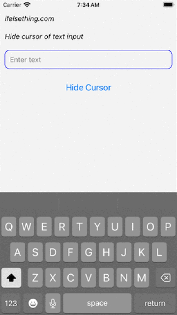
We can observe that, when toggling the caretHidden value, the cursor starts showing or hiding when we type characters after the toggle.
Complete code of our example,
//App.tsx
import { useState } from "react";
import {
  View,
  Text,
  StyleSheet,
  TextInput,
  Button,
} from "react-native";

export const App = () => {
  const [isHidden, setIsHidden] = useState(false);
  return (
    <View style={styles.container} >
      <Text style={styles.text}>
        ifelsething.com
      </Text>
      <Text style={styles.text}>
        Hide cursor of text input
      </Text>
      <TextInput
        style={styles.input}
        keyboardType='default'
        placeholder="Enter text"
        placeholderTextColor='gray'
        caretHidden={isHidden}
        autoFocus={true}
        showSoftInputOnFocus={true}
        autoCorrect={false}
      />
      <Button
        title={isHidden ? "Show Cursor" : "Hide Cursor"}
        onPress={() => {
          setIsHidden(!isHidden);
        }}
      />
    </View>
  );
}

const styles = StyleSheet.create({
  container: {
    flex: 1,
    margin: 10,
    gap: 20,
  },
  input: {
    borderColor: 'blue',
    borderWidth: 1,
    borderRadius: 10,
    padding: 10,
    fontSize: 15,
    color: 'black',
  },
  text: {
    fontSize: 15,
    color: 'black',
    fontStyle: 'italic'
  },
});
Related Posts
 Get Content Scroll Position Inside React Native TextInput
 Change Cursor Position of React Native Text Input
 ClearButtonMode in React Native TextInput
 Get Content Width and Height of React Native TextInput
 How to get Keyboard Metrics without Using Events in React Native?
 Hide Keyboard on Focus of React Native TextInput
 Disable Return Key on Empty TextInput
- How to Disable Auto Correct in React Native TextInput?
- Using keyboardShouldPersistTaps Prop of ScrollView