Hide React Native Keyboard with Floating Done Button
Published On: 2024-02-24
Posted By: Harish
We can dismiss the keyboard by tapping outside of text input field or dismiss even on scroll inside ScrollView component.
But what if there is no outside tap or scrollview to dismiss the keyboard is available. In android we have gestures or hide buttons for almost all android devices. But for iOS, we don't have any gesture or button to close the opened keyboard without pressing enter or return button.
In this post, we will see an implementation of this scenario. This post is only applicable for react native ios apps because we are using keyboard event listeners to hide and show floating done button block. You will see what I mean by further reading.
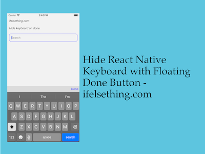
What are we creating
So, when the keyboard opens, we will see a block above the keyboard with a done button. If we close the keyboard by pressing this button, the keyboard will dismiss and the done block will hide with the keyboard.
Let's check the implementation.
Create A New Project
Create a new react-native project by using npx. Check documentation for creating a new react native project.
npx react-native@latest init KeyboardRN
Add Required Components with TextInput
Import KeyboardAvoidingView and keep it as the parent component. This component should be the parent of the SafeAreaView component too. This way you will see the correct implementation without any workarounds. If SafeareaView is already mentioned in a higher order component, then you can use keyboardVerticalOffset to get the correct height of the keyboard and to push the floating block above the keyboard view.
For our case, we are keeping SafeAreaView inside the KeyboardAvoidingView component.
//app.tsx
import {
  KeyboardAvoidingView,
  SafeAreaView,
  Platform,
  StatusBar,
} from "react-native";

...

export const App = () => {
  return (
    <KeyboardAvoidingView
      style={{ flex: 1 }}
      behavior={
        Platform.OS === 'ios'
          ? 'padding'
          : 'height'
      }
    >
      <SafeAreaView style={{ flex: 1 }}>
        <StatusBar
          barStyle="dark-content"
        />
      </SafeAreaView>
    </KeyboardAvoidingView>
  );
Now inside SafeAreaView, we will take two views one for TextInput and another view is for a button block which hides with the keyboard.
Import TextInput, View components from react-native. With flex, views will automatically get adjusted with changes in heights.
As we animate the hiding and showing of the floating done block, import Animated from react-native and add the Animated.View component for the floating block.
Import TouchableOpacity component for creating a done button.
import {
  ...
  View,
  Text,
  StyleSheet,
  TextInput,
  TouchableOpacity,
  Animated,
} from "react-native";

...

<TextInput
  style={styles.input}
  keyboardType='default'
  returnKeyType='search'
  placeholder="Search"
  placeholderTextColor='gray'
  autoFocus={true}
  showSoftInputOnFocus={true}
/>
<Animated.View style={[
  styles.above_keyboard
]}>
  <TouchableOpacity>
    <Text style={styles.above_keyboard_text}>
      Done
    </Text>
  </TouchableOpacity>
</Animated.View>
If you run the app,
#for Android
npx react-native run-android

#for ios
npx react-native run-ios
You will see a block with a button which floats with the keyboard. Now we have to hide the block when the keyboard closes.
For this functionality, I hardcoded the height of the block to 30. Now we have to animate the block view to show when the keyboard starts opening and hide when the keyboard starts closing.
To know when the keyboard starts opening or closing, we have to use keyboardWillShow and keyboardWillHide keyboard events. These events only work in iOS not for android.
So, based on these events, we will start animating the marginBottom value of the block to show and hide. To hide, I used a hardcoded height value with a negative margin bottom. This is one way, you can implement other ways if applicable.
We will call keyboard events in useEffect and pass required functions to animate the floating block. Now to close the keyboard, we can simply call Keyboard.dismiss() in onPress callback of TouchableOpacity.
Complete code,
//app.tsx
import { useEffect, useState } from "react";
import {
  View,
  Text,
  StyleSheet,
  TextInput,
  Keyboard,
  TouchableOpacity,
  KeyboardAvoidingView,
  Platform,
  SafeAreaView,
  StatusBar,
  Animated,
  KeyboardEvent
} from "react-native";

export const App = () => {
  const [marginBottom, _] = useState(new Animated.Value(-30));
  useEffect(() => {
    const showSub = Keyboard.addListener('keyboardWillShow', showKeyboard);
    const hideSub = Keyboard.addListener('keyboardWillHide', hideKeyboard);
    return () => {
      showSub.remove();
      hideSub.remove();
    };
  }, []);
  const showKeyboard = (e: KeyboardEvent) => {
    Animated.timing(
      marginBottom,
      {
        toValue: 0,
        duration: e.duration,
        useNativeDriver: false
      }
    ).start();
  };
  const hideKeyboard = (e: KeyboardEvent) => {
    Animated.timing(
      marginBottom,
      {
        toValue: -30,
        duration: e.duration,
        useNativeDriver: false
      }
    ).start();
  };
  const closeKeyboard = () => {
    Keyboard.dismiss();
  };
  return (
    <KeyboardAvoidingView
      style={{ flex: 1 }}
      behavior={
        Platform.OS === 'ios'
          ? 'padding'
          : 'height'
      }
    >
      <SafeAreaView style={{ flex: 1 }}>
        <StatusBar
          barStyle="dark-content"
        />
        <View style={styles.container}>
          <Text style={styles.text}>
            ifelsething.com
          </Text>
          <Text style={styles.text}>
            Hide keyboard on done
          </Text>
          <TextInput
            style={styles.input}
            keyboardType='default'
            returnKeyType='search'
            placeholder="Search"
            placeholderTextColor='gray'
            autoFocus={true}
            showSoftInputOnFocus={true}
          />
        </View>
        <Animated.View style={[
          styles.above_keyboard,
          {
            marginBottom: marginBottom
          }
        ]}>
          <TouchableOpacity onPress={closeKeyboard}>
            <Text style={styles.above_keyboard_text}>
              Done
            </Text>
          </TouchableOpacity>
        </Animated.View>
      </SafeAreaView>
    </KeyboardAvoidingView>
  );
}

const styles = StyleSheet.create({
  container: {
    flex: 1,
    margin: 10,
    gap: 20,
  },
  input: {
    borderColor: 'blue',
    borderWidth: 1,
    borderRadius: 10,
    padding: 10,
    fontSize: 15,
    color: 'black',
  },
  text: {
    fontSize: 15,
    color: 'black',
    fontStyle: 'italic'
  },
  above_keyboard: {
    flexShrink: 1,
    justifyContent: 'center',
    alignItems: 'flex-end',
    padding: 5,
    backgroundColor: 'gainsboro',
    height: 30,
  },
  above_keyboard_text: {
    color: 'blue',
    fontSize: 16,
  }
});
Related Posts
 Keyboard Key Press Events of React Native TextInput
 What are Keyboard Change Frame Events in React Native
- Get Event Before Keyboard Opening or Closing in React Native
- How to Focus on React Native TextInput using useRef Hook?
 Placeholder for React Native TextInput
- How to Automatically Focus on Next React Native TextInput?
 Hide Content of React Native TextInput
- Difference Between onEndEditing and onSubmitEditing in React Native
- What is AllowFontScaling Prop in React Native?