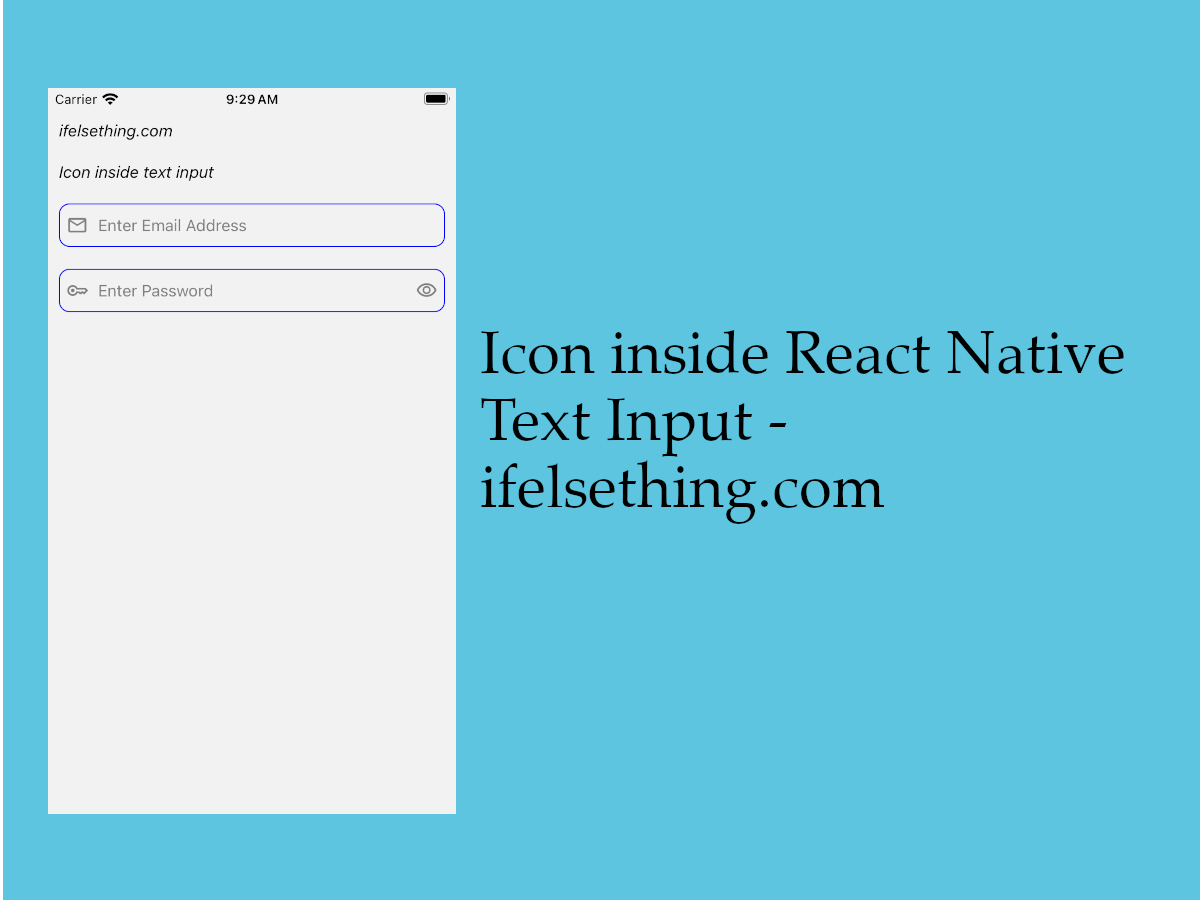
Icon Inside React Native Text Input
Published On: 2024-03-29
Posted By: Harish
Sometimes we may see icons inside text input for better design. In general, we may see this kind of design for login screens.
For icon placement, we don't have a fixed way to implement but we can place them using styles. For android devices, text input has a prop, inlineImageLeft which places an icon to the left of the input field. But this is limited to only the left position inside text input. We can't place it at other positions, like a show/hide icon at the right position inside a password field.
So, in this post we will implement a way to use props for android devices and a custom way to place an icon inside the input field for both platforms.
We will be using svg as a component process to integrate an icon in react native. You can also check svg as an image or free icons for react native posts if you want other ways to use an icon in react native.
Let's check the implementation.
Create A New Project
Create a new react-native project by using npx. Check documentation for creating a new react native project.
npx react-native@latest init TextInputRN
Example Implementation
We will implement a simple screen with two text inputs. One for email address and one for password. First we will check the android implementation and then for both operating systems.
First, import the TextInput component in the App.tsx file, add two text inputs and add required props to them.
//App.tsx
...
import { TextInput } from 'react-native';
...
<TextInput
  style={styles.input}
  inputMode='email'
  placeholder="Enter Email Address"
  placeholderTextColor='gray'
  autoCorrect={false}
  autoCapitalize='none'
/>
<TextInput
  style={styles.input}
  keyboardType='default'
  placeholder="Enter Password"
  placeholderTextColor='gray'
  autoCorrect={false}
  secureTextEntry={true}
  autoCapitalize='none'
/>
...
First, we will see the implementation for android devices. This is applicable when you are working on only android apps. This will not apply for iOS devices.
Only for Android Devices
For android devices, we can use inlineImageLeft and inlineImagePadding props to simply integrate an icon inside the input field. This does not need to convert an svg to component or vector image but requires a svg or png image file to use as an asset.
First open project’s android folder in Android Studio, if you don't have an android studio application, download from official website.
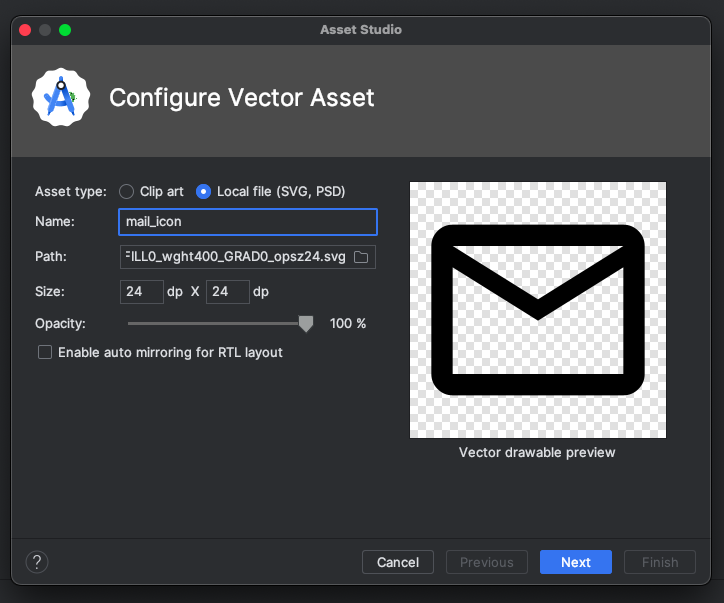
After the project's successful build, we have to upload the image or svg file to the drawable folder. We can find this folder at /android/app/src/main/res/drawable.
You should not just copy and paste the image inside the folder. Paste the image only through android studio. So, to upload an svg or image, right click on the drawable folder, choose New and select Vector Asset. Choose Image Asset if you want to use a .png image.
I personally prefer to use svg icons over png images, so we will go with Vector Asset. Choose the Local File option to select an svg from the computer. Name the icon to use with the prop, so we will name mail_icon and password_icon for our icons. These svg icons are taken from Google Fonts Icons.
Now build the app in android studio. And that's it for svg or image integration for react native android. Now go to our App.tsx file and add inlineImageLeft prop to the two text inputs with the correct uploaded icon names.
We can use the inlineImagePadding prop to correctly have padding between the icon and the input text. Please note that the text input style’s padding is for complete content inside text input, in this case for both icon and text. But with inlineImagePadding, padding is only applicable between the icon and text.
...
<TextInput
  ...
  style={styles.input}
  inlineImageLeft='mail_icon'
  inlineImagePadding={20}
/>
<TextInput
  ...
  style={styles.input}
  inlineImageLeft='password_icon'
  inlineImagePadding={20}
/>
...

//styles
input: {
  flexGrow: 1,
  borderWidth: 1,
  borderRadius: 10,
  padding: 10,
  fontSize: 15,
  color: 'black',
  borderColor: 'blue'
}
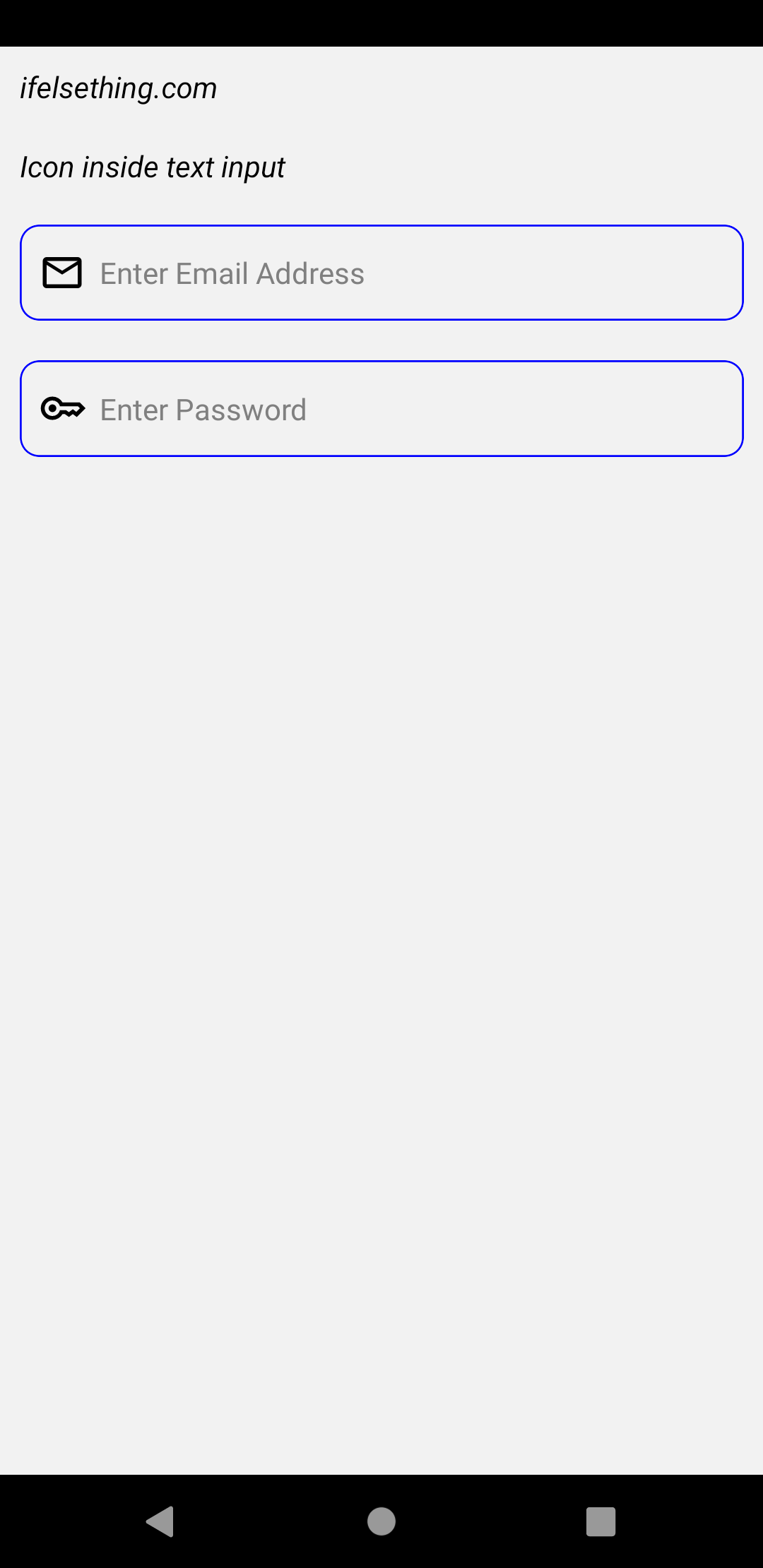
If we run the android app
#for Android
npx react-native run-android
We can see like the image below.
For both iOS and Android
Like I said, the above implementation is only for android devices and that too only for left placement. What if you want icons for both platforms? In that case, we will take the help of style to view the icon as it is placed inside text input.
For this, remove the inlineImageLeft and inlineImagePadding props from the text inputs. Now we have to convert icons to svg components. You can find the process in this post.
We created EmailIcon and PasswordIcon icon components. Check below complete code for icons conversion.
Place these components above or below the text inputs inside a View. Wrap this icon view and text input inside a view.
With this structure, we can make the whole text input and icon view’s position relative and icon’s view to absolute. In this way we can place the icon inside text input.
Check below complete code for better understanding.
I also used a show/hide icon which is generally placed to the right of the password input. With the click on these icons, we can change secureTextEntry value, which is used to show or hide the input text. Default value is false.
Import useState from react and declare a state variable to set and get the state of the show/hide icon. By default we will have a show icon and isPasswordVisible value to false. When we press the show icon, the state value is changed to true and the show icon is replaced with hide icon.
Check below the complete code block for implementation.
Now the run the app,
#for Android
npx react-native run-android

#for ios
npx react-native run-ios
After successful implementation, you can see it working like the gif below.
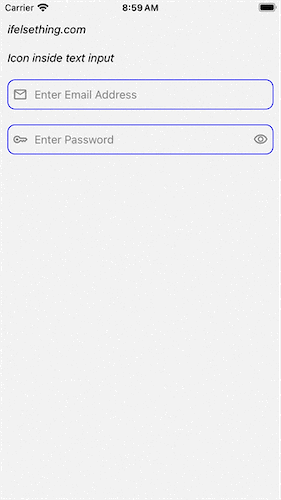
Complete code of our example,
//App.tsx
import { useState } from 'react';
import {
  View,
  Text,
  StyleSheet,
  TextInput,
  SafeAreaView,
  StatusBar,
  TouchableOpacity
} from "react-native";
import Svg, { Path } from 'react-native-svg';

type SvgProps = {
  width?: number,
  height?: number,
  fill?: string
};

export default function App() {
  const [isPasswordVisible, setIsPasswordVisible] = useState<boolean>(false);
  const EmailIcon = (props: SvgProps) => {
    const {
      width = 20,
      height = 20,
      fill = 'gray'
    } = props;
    return (
      <Svg
        height={width}
        viewBox="0 -960 960 960"
        width={height}
        fill={fill}
      >
        <Path d="M160-160q-33 0-56.5-23.5T80-240v-480q0-33 23.5-56.5T160-800h640q33 0 56.5 23.5T880-720v480q0 33-23.5 56.5T800-160H160Zm320-280L160-640v400h640v-400L480-440Zm0-80 320-200H160l320 200ZM160-640v-80 480-400Z" />
      </Svg>
    );
  };
  const PasswordIcon = (props: SvgProps) => {
    const {
      width = 20,
      height = 20,
      fill = 'gray'
    } = props;
    return (
      <Svg
        height={width}
        viewBox="0 -960 960 960"
        width={height}
        fill={fill}
      >
        <Path d="M280-400q-33 0-56.5-23.5T200-480q0-33 23.5-56.5T280-560q33 0 56.5 23.5T360-480q0 33-23.5 56.5T280-400Zm0 160q-100 0-170-70T40-480q0-100 70-170t170-70q67 0 121.5 33t86.5 87h352l120 120-180 180-80-60-80 60-85-60h-47q-32 54-86.5 87T280-240Zm0-80q56 0 98.5-34t56.5-86h125l58 41 82-61 71 55 75-75-40-40H435q-14-52-56.5-86T280-640q-66 0-113 47t-47 113q0 66 47 113t113 47Z" />
      </Svg>
    );
  };
  const ShowIcon = (props: SvgProps) => {
    const {
      width = 20,
      height = 20,
      fill = 'gray'
    } = props;
    return (
      <Svg
        height={width}
        viewBox="0 -960 960 960"
        width={height}
        fill={fill}
      >
        <Path d="M480-320q75 0 127.5-52.5T660-500q0-75-52.5-127.5T480-680q-75 0-127.5 52.5T300-500q0 75 52.5 127.5T480-320Zm0-72q-45 0-76.5-31.5T372-500q0-45 31.5-76.5T480-608q45 0 76.5 31.5T588-500q0 45-31.5 76.5T480-392Zm0 192q-146 0-266-81.5T40-500q54-137 174-218.5T480-800q146 0 266 81.5T920-500q-54 137-174 218.5T480-200Zm0-300Zm0 220q113 0 207.5-59.5T832-500q-50-101-144.5-160.5T480-720q-113 0-207.5 59.5T128-500q50 101 144.5 160.5T480-280Z" />
      </Svg>
    );
  };
  const HideIcon = (props: SvgProps) => {
    const {
      width = 20,
      height = 20,
      fill = 'gray'
    } = props;
    return (
      <Svg
        height={width}
        viewBox="0 -960 960 960"
        width={height}
        fill={fill}
      >
        <Path d="m644-428-58-58q9-47-27-88t-93-32l-58-58q17-8 34.5-12t37.5-4q75 0 127.5 52.5T660-500q0 20-4 37.5T644-428Zm128 126-58-56q38-29 67.5-63.5T832-500q-50-101-143.5-160.5T480-720q-29 0-57 4t-55 12l-62-62q41-17 84-25.5t90-8.5q151 0 269 83.5T920-500q-23 59-60.5 109.5T772-302Zm20 246L624-222q-35 11-70.5 16.5T480-200q-151 0-269-83.5T40-500q21-53 53-98.5t73-81.5L56-792l56-56 736 736-56 56ZM222-624q-29 26-53 57t-41 67q50 101 143.5 160.5T480-280q20 0 39-2.5t39-5.5l-36-38q-11 3-21 4.5t-21 1.5q-75 0-127.5-52.5T300-500q0-11 1.5-21t4.5-21l-84-82Zm319 93Zm-151 75Z" />
      </Svg>
    );
  };
  return (
      <SafeAreaView style={{ flex: 1 }}>
        <StatusBar
          barStyle="dark-content"
        />
        <View style={styles.container} >
          <Text style={styles.text}>
            ifelsething.com
          </Text>
          <Text style={styles.text}>
            Icon inside text input
          </Text>
          <View style={styles.input_block}>
            <TextInput
              style={styles.input}
              inputMode='email'
              placeholder="Enter Email Address"
              placeholderTextColor='gray'
              autoCorrect={false}
              autoCapitalize='none'
              // inlineImageLeft='mail_icon' //For Android only
              // inlineImagePadding={20} //For Android only
            />
            <View style={styles.icon_block}>
              <EmailIcon />
            </View>
          </View>
          <View style={styles.input_block}>
            <TextInput
              style={styles.input}
              keyboardType='default'
              placeholder="Enter Password"
              placeholderTextColor='gray'
              autoCorrect={false}
              secureTextEntry={isPasswordVisible ? false : true}
              autoCapitalize='none'
              // inlineImageLeft='password_icon' //For Android only
              // inlineImagePadding={20} //For Android only
            />
            <View style={styles.icon_block}>
              <PasswordIcon />
            </View>
             {
              !isPasswordVisible
              && <TouchableOpacity
                onPress={() => setIsPasswordVisible(previous => !previous)}
                style={styles.visible_block}
              >
                <ShowIcon />
              </TouchableOpacity>
            }
            {
              isPasswordVisible
              && <TouchableOpacity
                onPress={() => setIsPasswordVisible(previous => !previous)}
                style={styles.visible_block}
              >
                <HideIcon />
              </TouchableOpacity>
            }
          </View>
        </View>
      </SafeAreaView>
  );
}

const styles = StyleSheet.create({
  container: {
    flex: 1,
    margin: 10,
    gap: 20,
  },
  input: {
    flexGrow: 1,
    borderWidth: 1,
    borderRadius: 10,
    paddingHorizontal: 35,
    paddingVertical: 10,
    fontSize: 15,
    color: 'black',
    borderColor: 'blue'
  },
  text: {
    fontSize: 15,
    color: 'black',
    fontStyle: 'italic'
  },
  input_block: {
    flexDirection: 'row',
    alignItems: 'center',
    position: 'relative'
  },
  icon_block: {
    position: 'absolute',
    left: 7
  },
  visible_block: {
    position: 'absolute',
    right: 7
  }
});
Related Posts
 How to Show Transformed Text in React Native TextInput Field?
 Textarea for React Native
- How to get Keyboard Metrics without Using Events in React Native?
- How to Automatically Focus on Next React Native TextInput?
 Disable Full Screen Text Input Mode in React Native
- Hide Keyboard on Scroll in React Native
- How to Know if React Native Keyboard is Opened or Closed?
 Keyboard Key Press Events of React Native TextInput
- How to Focus on React Native TextInput using useRef Hook?