Masonry List in React Native
Published On: 2024-10-01
Posted By: Harish
We have seen a way to show a list with two or more columns using FlatList's numColumn prop. But that approach is only applicable for lists with equal height items.
But what if our list items have different heights?
In that case we can use a VirtualizedList to create a custom list component to accept list items with different heights. But they may have performance issues.
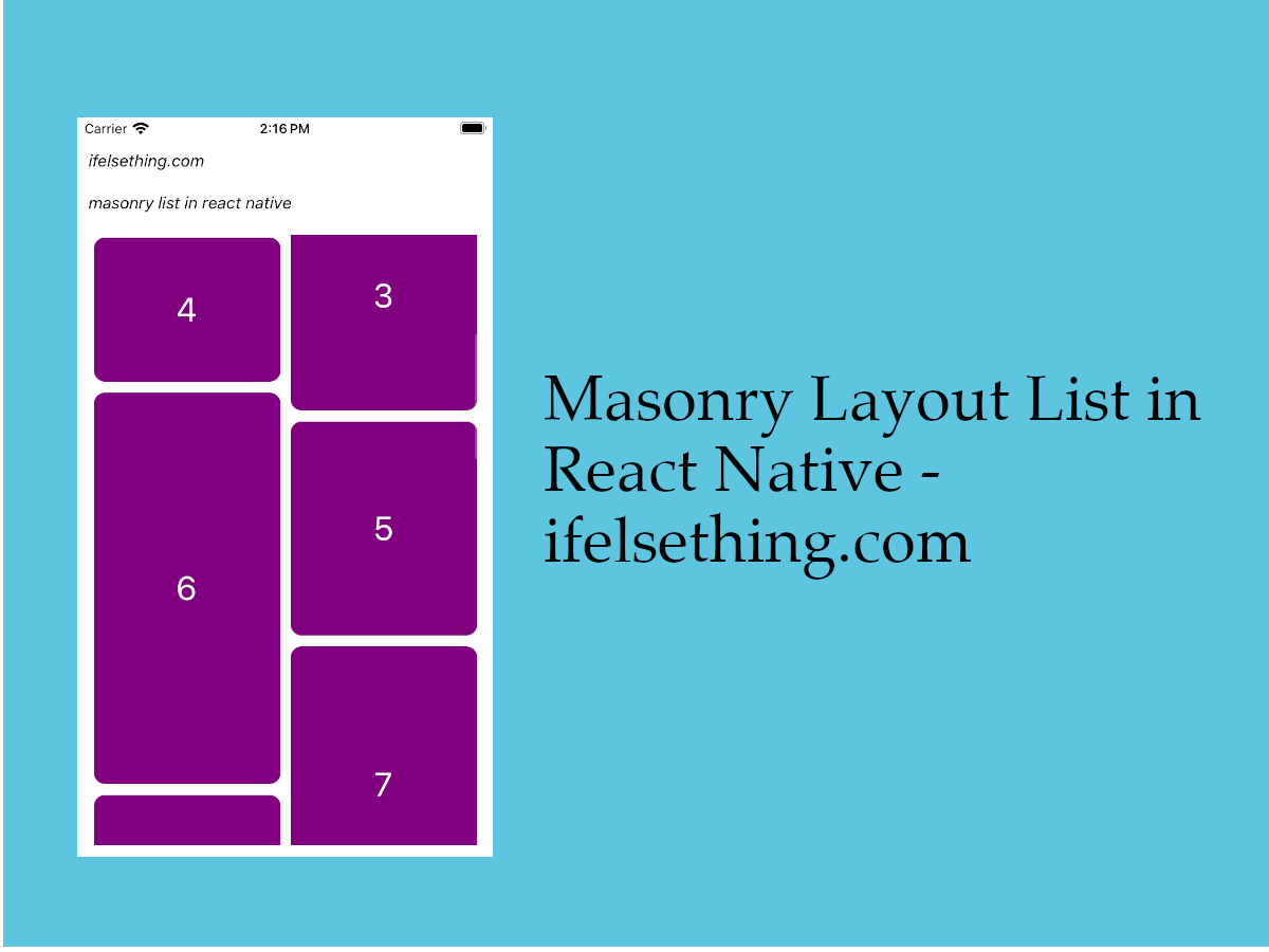
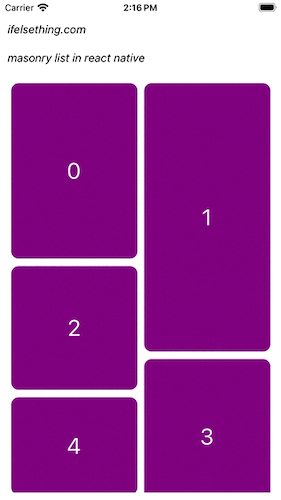
This uneven height list is generally called a masonry list. So, in this post, instead of VirtualizedList, we will be using a fast list library from Shopify, FlashList which has a default masonry list component.
Let's check this FlashList masonry list component with an example.
Create A New Project
Create a new react-native project by using npx. Check documentation for creating a new react native project.
npx react-native@latest init MasonryListRN
Example Implementation
We will create a simple masonry list using the FlashList library.
First install shopify's FlatList package.
#npm
npm i @shopify/flash-list

#yarn
yarn add @shopify/flash-list
After successful installation, the masonry component is ready to be used.
If you are using this on an iOS device, make sure to run pod install.
Import MasonryFlashList from @shopify/flash-list and add to the view.
//App.tsx
import { MasonryFlashList } from "@shopify/flash-list";
...
<MasonryFlashList />
...
First we will add the number of columns of the list.
For our example, I want two columns, so add numColumns=2
...
<MasonryFlashList
  numColumns={2}
/>
...
Now add data to our masonry list by using data prop.
...
<MasonryFlashList
  numColumns={2}
  data={dataList}
/>
...
You can find the complete code of our dummy data down below the post.
Next, add the list item view with the help of renderItem callback.
...
<MasonryFlashList
  numColumns={2}
  data={dataList}
  renderItem={({ item }) => {
    return (
      <Item item={item} />
    )
  }}
/>
...
This renderItem callback function is similar to react native FlatList prop. For info, check the basic FlatList example too.
And then add an estimatedItemSize prop which is an estimation of average list item height.
You can give a guessed height. Like in our example, our block heights are between 100 and 300, so our average estimation height can be 200.
Giving an estimated height helps the component to calculate the layout faster which increases the performance.
We used a similar estimated height of the item to programmatically scroll to FlatList list items.
...
<MasonryFlashList
  numColumns={2}
  data={dataList}
  renderItem={({ item }) => {
    return (
      <Item item={item} />
    )
  }}
   estimatedItemSize={200}
/>
...
Now run the app,
#for Android
npx react-native run-android

#for ios
npx react-native run-ios
As our list items are of different heights, we can see a list with masonry layout.
So, this is one of the ways to add a masonry list in a react native app.
Complete code of our example,
//App.tsx
import React, { useState, useEffect } from "react";
import {
  Text,
  StyleSheet,
  SafeAreaView,
  StatusBar,
  View
} from "react-native";
import { MasonryFlashList } from "@shopify/flash-list";

type ItemDataProp = {
  id: number;
  height: number;
};

export default function App() {

  const [dataList, setDataList] = useState<Array<ItemDataProp>>([]);

  const data = () => {
    const list: ItemDataProp[] = [...Array(20).keys()].map(m => {
      return {
        id: m,
        height: Math.floor(Math.random() * 300) + 100
      }
    });
    setDataList(list);
  };

  useEffect(() => {
    data();
  }, []);

  const Item = ({ item }: { item: ItemDataProp }) => {
    return (
      <View
        key={item.id}
        style={[
          styles.item_view,
          {
            width: '95%',
            margin: 5,
            height: item.height
          }
        ]}
      >
        <Text style={styles.item_text}>{item.id}</Text>
      </View>
    )
  };

  return (
    <SafeAreaView style={{ flex: 1, backgroundColor: 'white' }}>
      <StatusBar
        barStyle="dark-content"
      />
      <View style={styles.container}>
        <Text style={styles.text}>
          ifelsething.com
        </Text>
        <Text style={styles.text}>
          masonry list in react native
        </Text>
        <MasonryFlashList
          data={dataList}
          numColumns={2}
          renderItem={({ item }) => {
            return (
              <Item item={item} />
            )
          }}
          estimatedItemSize={200}
        />
      </View>
    </SafeAreaView>
  );
}

const styles = StyleSheet.create({
  container: {
    flex: 1,
    margin: 10,
    gap: 20
  },
  text: {
    fontSize: 15,
    color: 'black',
    fontStyle: 'italic'
  },
  item_view: {
    width: '100%',
    height: 200,
    borderRadius: 10,
    backgroundColor: 'purple',
    alignItems: 'center',
    justifyContent: 'center'
  },
  item_text: {
    color: 'white',
    fontSize: 30,
  }
});
Related Posts
 Stop Scrolling at Regular Intervals in React Native
 Empty Data Component of VirtualizedList
 Stop Scrolling at Irregular Intervals in React Native
 Show No Data on Empty FlatList
 Horizontal VirtualizedList
 Refresh in React Native ScrollView
 Columns in a FlatList
 Pull down to Refresh FlatList
 Cell Separator in VirtualizedList