SectionList in React Native
Published On: 2024-10-23
Posted By: Harish
Let's think of a scenario where we want a list with grouped items and a header to each group. Like a contact list, where we have a letter as a title and grouped contact names starting with that letter.
In that scenario, we can’t use a general ScrollView component , as ScrollView is best suited for small scrollable content and not for lists.
To avoid those performance issues and to show lists in react native, we have FlatList or VirtualizedList components.
But they are not suitable for our example as they have only one header and footer for the whole list. For our contact list example, we need many headers, in fact many sections with header and footer in a list.
Then in those cases, we can use react native’s SectionList component.
We can divide list data into sections with specific header or footer.
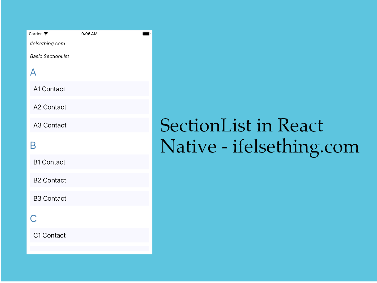
Let's check a basic SectionList using a contact list as an example.
Create A New Project
Create a new react-native project by using npx. Check documentation for creating a new react native project.
npx react-native@latest init SectionListRN
Example Implementation
We will create a simple contact list using the SectionList component.
First import a SectionList component from react-native and add to the view.
//App.tsx
import React from "react";
import { SectionList } from "react-native";
...
<SectionList
  contentContainerStyle={styles.content_container}
/>
...
We have added a basic content style to the sectionlist. You can find more info at contentContainerStyle prop for styling scrollview content post.
Next the main prop to add is sections prop.
Pass the data which needs to be shown in sections.
Unlike FlatList or Virtualized list data format, SectionList component data format is different and fixed.
So, whatever data you have, should be converted to a sectionlist format.
A sectionlist data should be an array list objects with title and data as properties.
...
const data = [
  {
    title: 'A',
    data: [
      'A1 Contact',
      'A2 Contact',
      'A3 Contact'
    ],
  },
  ...
]
...
Here, title key is optional and only add that when you want an individual header or footer to a section. But data is required.
...
<SectionList
  contentContainerStyle={styles.content_container}
  sections={data}
/>
...
Next, add a keyExtractor prop, used by react native for re-rendering purposes.
...
<SectionList
  contentContainerStyle={styles.content_container}
  sections={data}
  keyExtractor={(item, index) => item + index}
/>
...
keyExtractor prop has to be unique.
Next, add a list item view with the help of renderItem callback.
...
<SectionList
  contentContainerStyle={styles.content_container}
  sections={data}
  keyExtractor={(item, index) => item + index}
  renderItem={({ item }) => {
    return (
      <Item item={item} />
    )
  }}
/>
...
This renderItem callback function is similar to react native FlatList prop. For info, check the basic FlatList example too.
Till now, we have implemented a list which are grouped together as sections.
For our example, a contact list, we have an alphabet as a title.
So, add renderSectionHeader function to show a header at the top of each section.
...
<SectionList
  contentContainerStyle={styles.content_container}
  sections={data}
  keyExtractor={(item, index) => item + index}
  renderItem={({ item }) => {
    return (
      <Item item={item} />
    )
  }}
  renderSectionHeader={({section: {title}}) => (
    <Text style={styles.header}>{title}</Text>
  )}
/>
...
If we use the renderSectionFooter function instead of renderSectionHeader, that title appears at the bottom of each section as a footer.
Now, run the app.
#for Android
npx react-native run-android

#for ios
npx react-native run-ios
You will see a list with a title and data related to that title in sections.
So, in this way, we can create a grouped content list in react native app;
Complete code of our example,
//App.tsx
import React from "react";
import {
  Text,
  StyleSheet,
  SafeAreaView,
  StatusBar,
  View,
  SectionList
} from "react-native";

const data = [
  {
    title: 'A',
    data: [
      'A1 Contact',
      'A2 Contact',
      'A3 Contact'
    ],
  },
  {
    title: 'B',
    data: [
      'B1 Contact',
      'B2 Contact',
      'B3 Contact'
    ],
  },
  {
    title: 'C',
    data: [
      'C1 Contact',
      'C2 Contact',
      'C3 Contact'
    ],
  },
  {
    title: 'D',
    data: [
      'D1 Contact',
      'D2 Contact',
      'D3 Contact',
      'D4 Contact'
    ],
  },
];

export default function App() {

  const Item = ({ item }: { item: string }) => {
    return (
      <View
        key={item}
        style={styles.item_view}

      >
        <Text style={styles.item_text}>{item}</Text>
      </View>
    )
  };

  return (
    <SafeAreaView style={{ flex: 1, backgroundColor: 'white' }}>
      <StatusBar
        barStyle="dark-content"
      />
      <View style={styles.container}>
        <Text style={styles.text}>
          ifelsething.com
        </Text>
        <Text style={styles.text}>
          Basic SectionList
        </Text>
        <SectionList
          contentContainerStyle={styles.content_container}
          sections={data}
          keyExtractor={(item, index) => item + index}
          renderItem={({ item }) => {
            return (
              <Item item={item} />
            )
          }}
          renderSectionHeader={({ section: { title } }) => (
            <Text style={styles.header}>{title}</Text>
          )}
        // renderSectionFooter={({section: {title}}) => (
        //   <Text style={styles.header}>{title}</Text>
        // )}
        />
      </View>
    </SafeAreaView>
  );
}

const styles = StyleSheet.create({
  container: {
    flex: 1,
    margin: 10,
    gap: 20
  },
  text: {
    fontSize: 15,
    color: 'black',
    fontStyle: 'italic'
  },
  content_container: {
    gap: 10
  },
  item_view: {
    backgroundColor: 'ghostwhite',
    alignItems: 'flex-start',
    justifyContent: 'center',
    padding: 10
  },
  item_text: {
    color: 'black',
    fontSize: 20,
  },
  header: {
    fontSize: 30,
    backgroundColor: 'white',
    color: 'steelblue'
  },
  item_separator: {
    height: 1,
    backgroundColor: 'lightgray'
  }
});
Related Posts
 How to Add Multiple Sticky Headers in React Native
 Header and Footer for React Native FlatList
 VirtualizedList in React Native
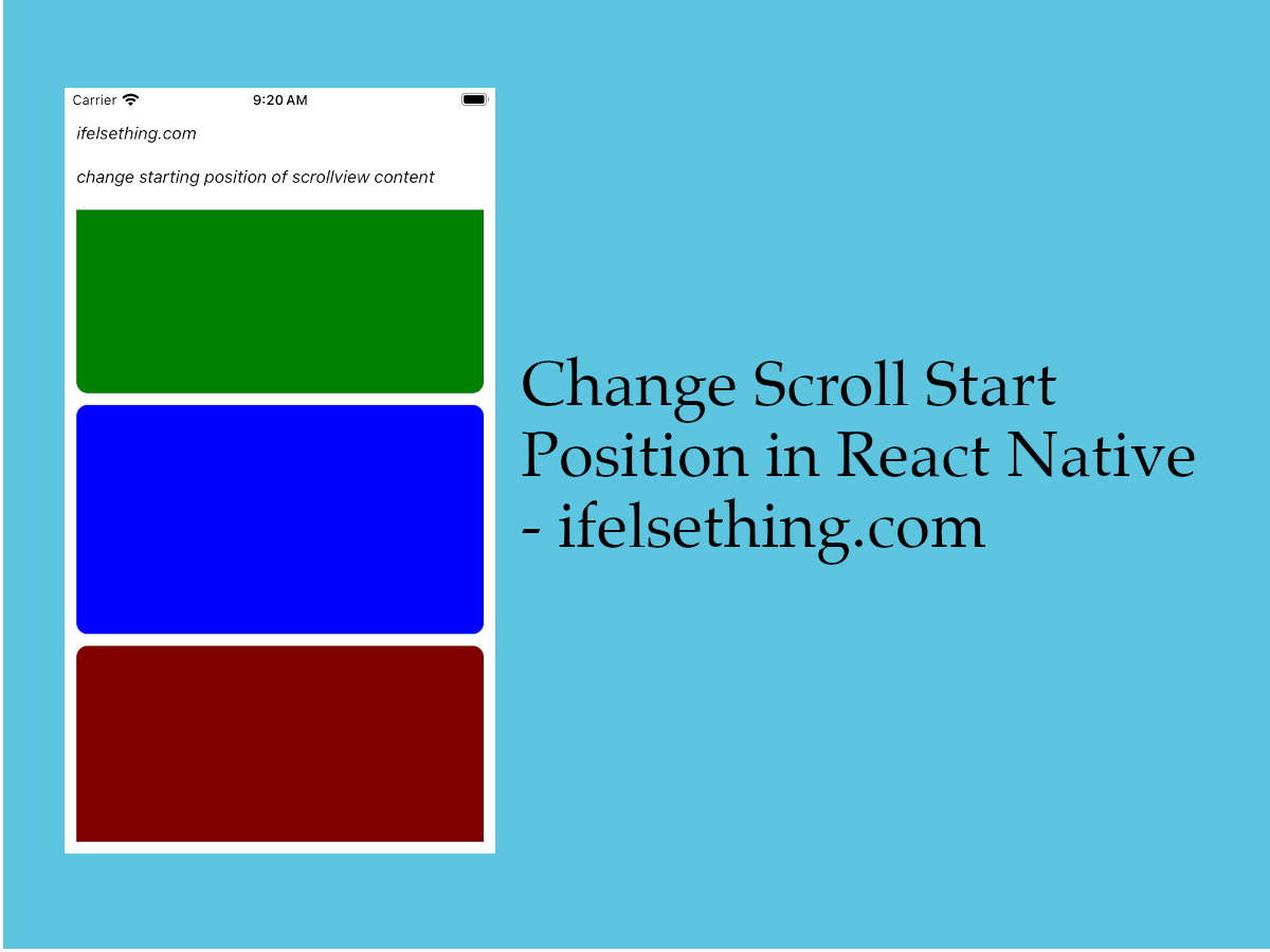 Start Scroll from Different Position in React Native
 Pull down to Refresh FlatList
 Refresh in React Native ScrollView
 Enable or Disable Scroll of React Native ScrollView
 Horizontal ScrollView in React Native
- How to Create A Draggable Items List in React Native