Separators in React Native SectionList
Published On: 2025-01-05
Posted By: Harish

Earlier, we discussed list item separators in FlatLists and VirtualizedLists.
In SectionList, we can use a component to separate items with the help of ItemSeparatorComponent and to separate sections with the help of SectionSeparatorComponent.
Lets check these separators with an example.
Create A New Project
Create a new react-native project by using npx. Check documentation for creating a new react native project.
npx react-native@latest init SectionListRN
Example Implementation
We will create a basic SectionList and add separators to its items and sections.
We will start directly with our SectionList implementation article example.
//App.tsx
...
<SectionList
  contentContainerStyle={styles.content_container}
  sections={data}
  keyExtractor={(item, index) => item + index}
  renderItem={({ item }) => {
    return (
      <Item item={item} />
    )
  }}
  renderSectionHeader={({ section: { title } }) => (
    <Text style={styles.header}>{title}</Text>
  )}
/>
...
As you can see from the above, we have a basic SectionList with a section header.
Now, we will add a separator in between its items.
For that, create a component to render between the items, in our post, we will render a line in between these items.
You can find the component code at the bottom of this post.
Now, the main part is to add a new prop to sectionlist called ItemSeparatorComponent. Pass the component to render that in between the items.
...
<SectionList
  ...
  ItemSeparatorComponent={SectionItemSeparator}
  ...
/>
...
If we re-run the app.
#for Android
npx react-native run-android

#for ios
npx react-native run-ios
We will see orange lines in between section items.
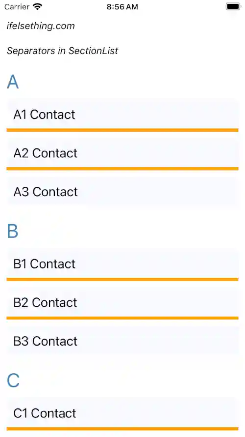
But the top of the first item and bottom of the last item don't have any orange line as separators.
Now, add another component to separate sections in a list.
For this, we will use a blue color line as a separator. You can find the code below..
Now, add another functional prop called SectionSeparatorComponent and pass the above created blue line component..
...
<SectionList
  ...
  SectionSeparatorComponent={SectionSeparator}
  ...
/>
...
If we re-run the app, we will see a blue line above the first item and bottom of the last item.
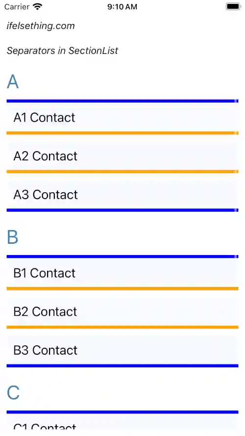
So, from this we can say that the section separator will be rendered at the top of the first item and bottom of the last item and the item separator component will render in between the items inside a section.
Complete code of our example,
//App.tsx
import React from "react";
import {
  Text,
  StyleSheet,
  SafeAreaView,
  StatusBar,
  View,
  SectionList
} from "react-native";

const data = [
  {
    title: 'A',
    data: [
      'A1 Contact',
      'A2 Contact',
      'A3 Contact'
    ]
  },
  {
    title: 'B',
    data: [
      'B1 Contact',
      'B2 Contact',
      'B3 Contact'
    ],
  },
  {
    title: 'C',
    data: [
      'C1 Contact',
      'C2 Contact',
      'C3 Contact'
    ],
  },
  {
    title: 'D',
    data: [
      'D1 Contact',
      'D2 Contact',
      'D3 Contact',
      'D4 Contact'
    ],
  },
];

export function App ()  {

  const Item = ({ item }: { item: string }) => {
    return (
      <View
        key={item}
        style={styles.item_view}

      >
        <Text style={styles.item_text}>{item}</Text>
      </View>
    )
  };

  const SectionSeparator = () => {
    return (
      <View style={styles.blue_line} />
    )
  };

  const SectionItemSeparator = () => {
    return (
      <View style={styles.orange_line} />
    )
  };

  return (
    <SafeAreaView style={{ flex: 1, backgroundColor: 'white' }}>
      <StatusBar
        barStyle="dark-content"
      />
      <View style={styles.container}>
        <Text style={styles.text}>
          ifelsething.com
        </Text>
        <Text style={styles.text}>
          Separators in SectionList
        </Text>
        <SectionList
          contentContainerStyle={styles.content_container}
          sections={data}
          keyExtractor={(item, index) => item + index}
          renderItem={({ item }) => {
            return (
              <Item item={item} />
            )
          }}
          renderSectionHeader={({ section: { title } }) => (
            <Text style={styles.header}>{title}</Text>
          )}
          SectionSeparatorComponent={SectionSeparator}
          ItemSeparatorComponent={SectionItemSeparator}
        />
      </View>
    </SafeAreaView>
  );
}

const styles = StyleSheet.create({
  container: {
    flex: 1,
    margin: 10,
    gap: 20
  },
  text: {
    fontSize: 15,
    color: 'black',
    fontStyle: 'italic'
  },
  content_container: {
    gap: 10
  },
  item_view: {
    backgroundColor: 'ghostwhite',
    alignItems: 'flex-start',
    justifyContent: 'center',
    padding: 10
  },
  item_text: {
    color: 'black',
    fontSize: 20,
  },
  header: {
    fontSize: 30,
    backgroundColor: 'white',
    color: 'steelblue'
  },
  blue_line: {
    flex: 1,
    backgroundColor: 'blue',
    height: 5
  },
  orange_line: {
    flex: 1,
    backgroundColor: 'orange',
    height: 5
  }
});
Related Posts
 Show No Data on Empty FlatList
 Refresh in React Native ScrollView
 SectionList in React Native
 Separate FlatList Items with a Component
 Cell Separator in VirtualizedList
 How to Create A Draggable Items List in React Native
 Horizontal ScrollView in React Native
 Cell Metrics in VirtualizedList
 Invert VirtualizedList